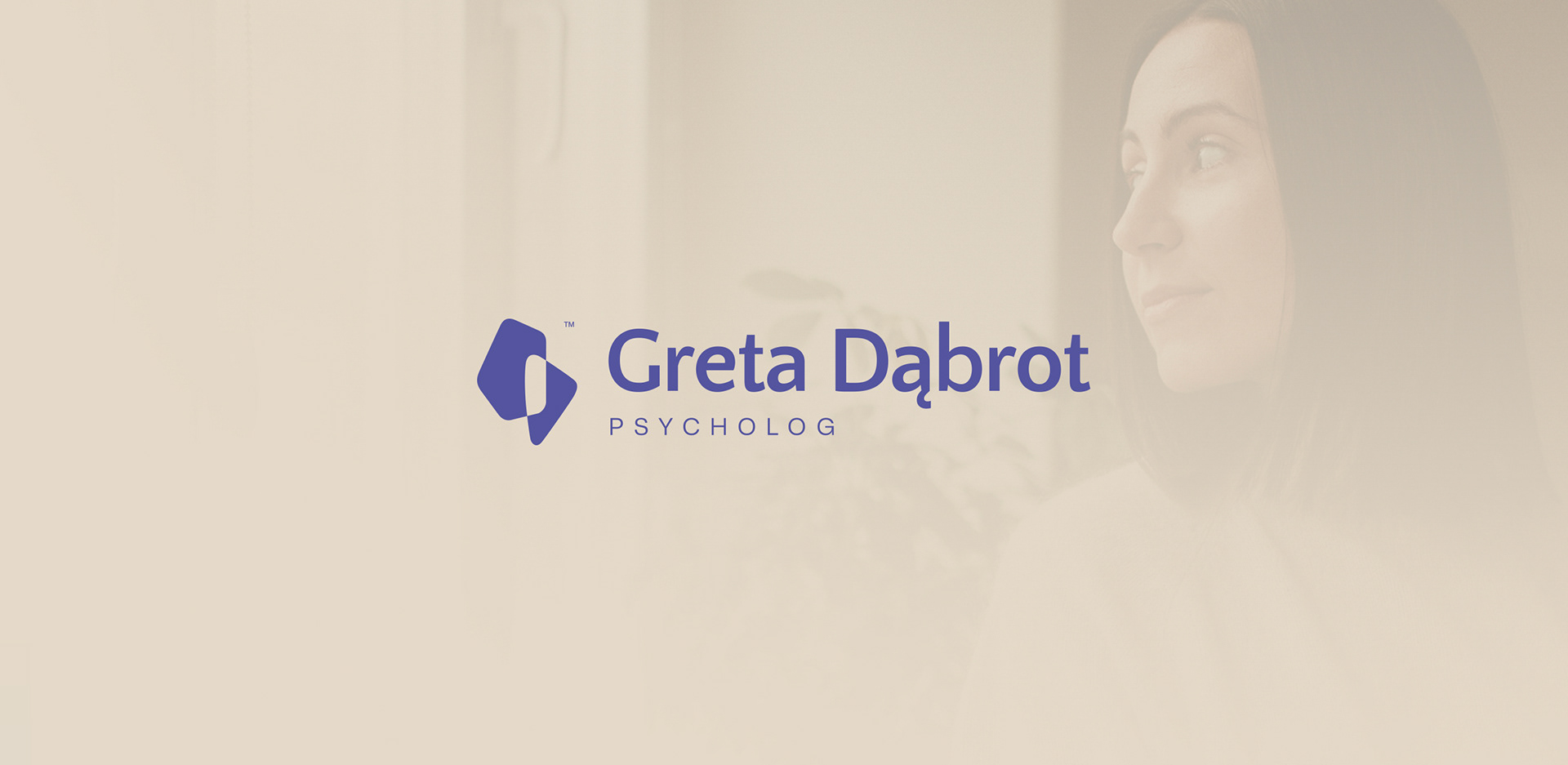
GRETA DĄBROT PSYCHOLOGIST
Concept:
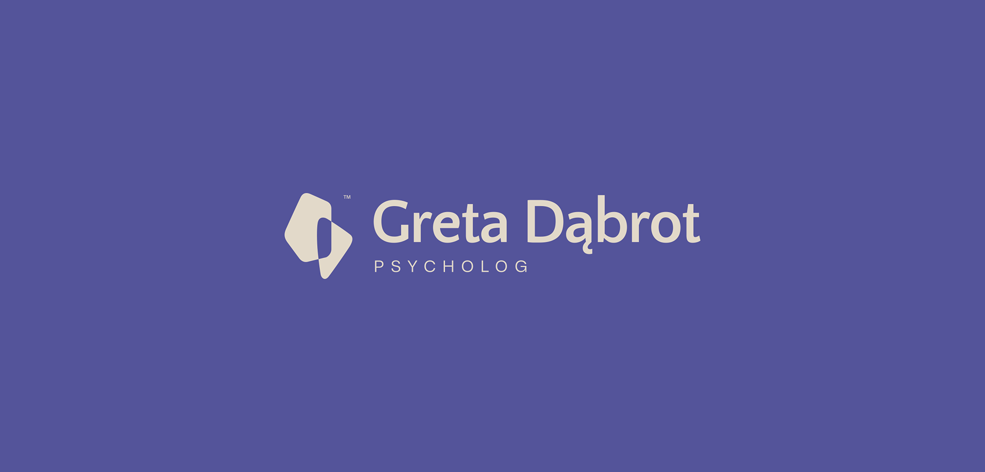
When designing a logo for a child and adolescent psychologist, I was sure that I want to stay away from cliched symbols like a “smiling sun”. I created a symbol that, like the therapy process itself, carries its own weight and history.
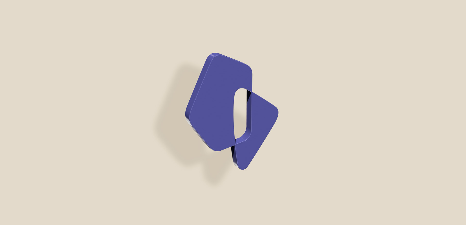
This signet represents an intimate relationship, an encounter, and a process. The shapes of real fragments of ceramic tiles, found on a beach near sunny Malaga and "sculpted" by the sea, symbolize the smoothing of difficult experiences. The tiles before they landed in the sea, were sharp fragments (a symbol of crisis, trauma). For years, the sea rolled the fragments along the seabed, smoothing its edges, just as the therapeutic process helps to soften difficult experiences. The ceramic fragments from the beach are a kind of "treasure" we seek. This suggests that every scar and every crack has its own story. The therapist helps us become this unique, "sculpted by fate" version of ourselves, which has a big value precisely because it has survived the storms.
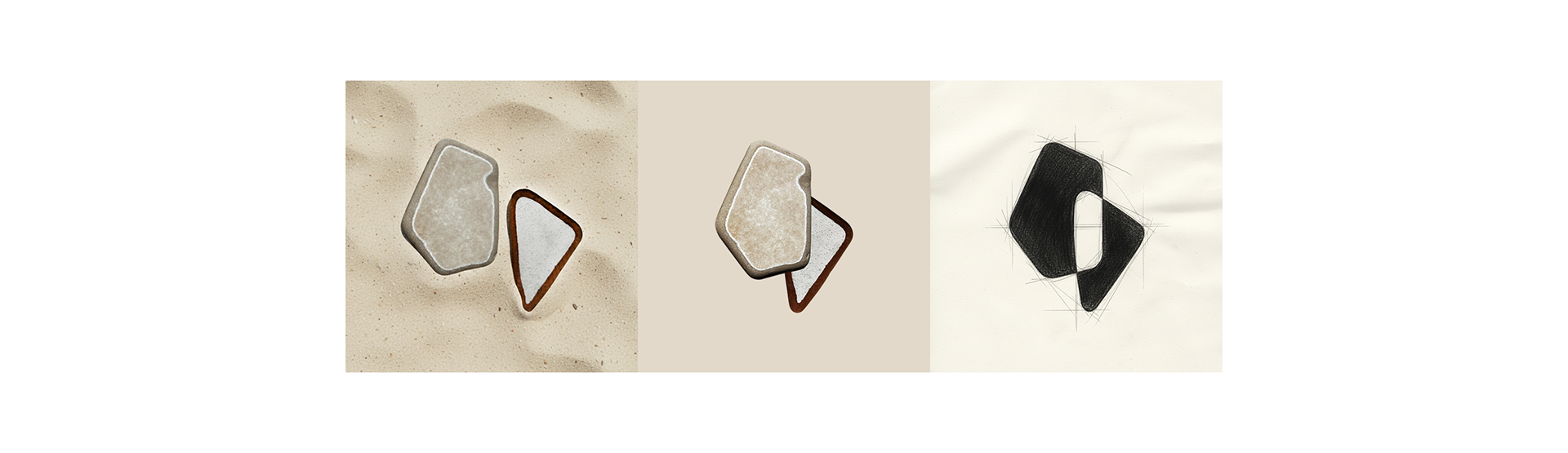
Two asymmetrical, organic forms overlap, creating a space within. The left and right sides represent the therapist and the patient. What happens "in between" is the therapeutic process, dialogue, and collaboration. It also symbolizes insight into emotions. It represents that moment on the beach when you pick up such ceramic piece and perceive its beauty. In therapy, it's the moment when the patient feels noticed and understood.
The forms are rounded, without rigid geometric lines, suggesting safety, gentleness, and a lack of judgment. In developmental psychology, this emphasizes a flexible approach. The therapist adapts to the young person's unique "shape" rather than forcing them into a pre-defined framework.
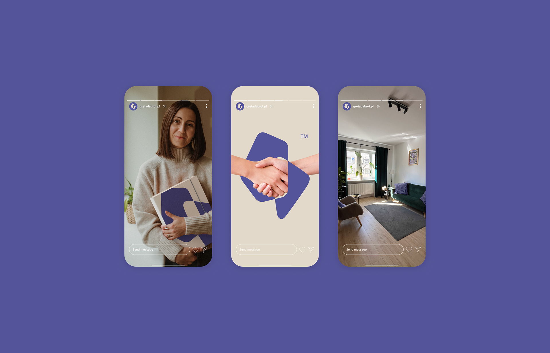
The final touch of personalizing this logo is the Greta Dąbrot acronym.
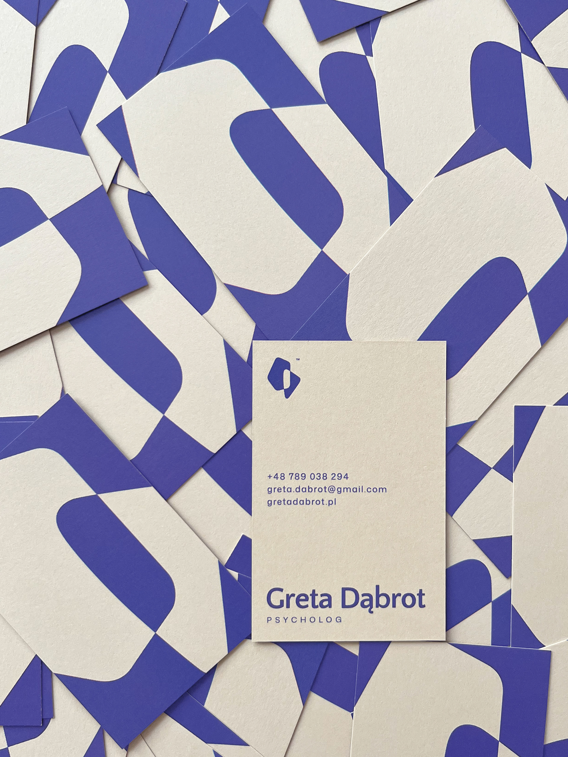
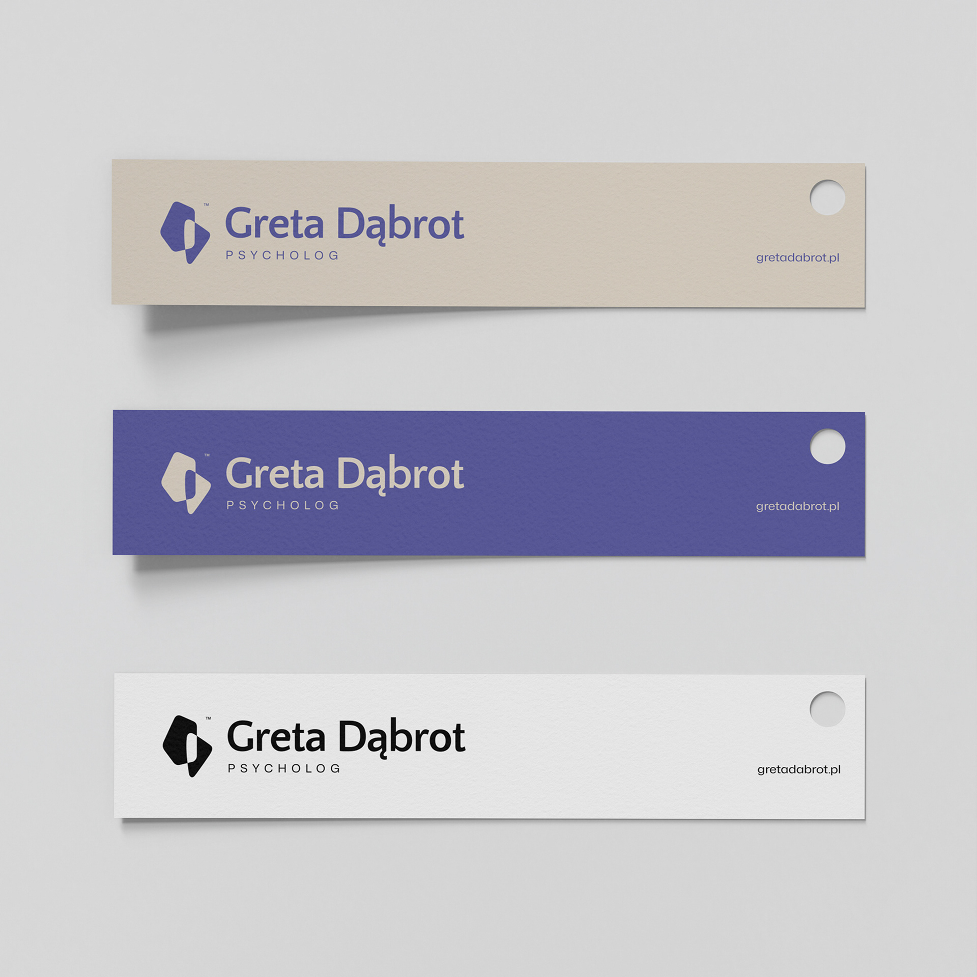
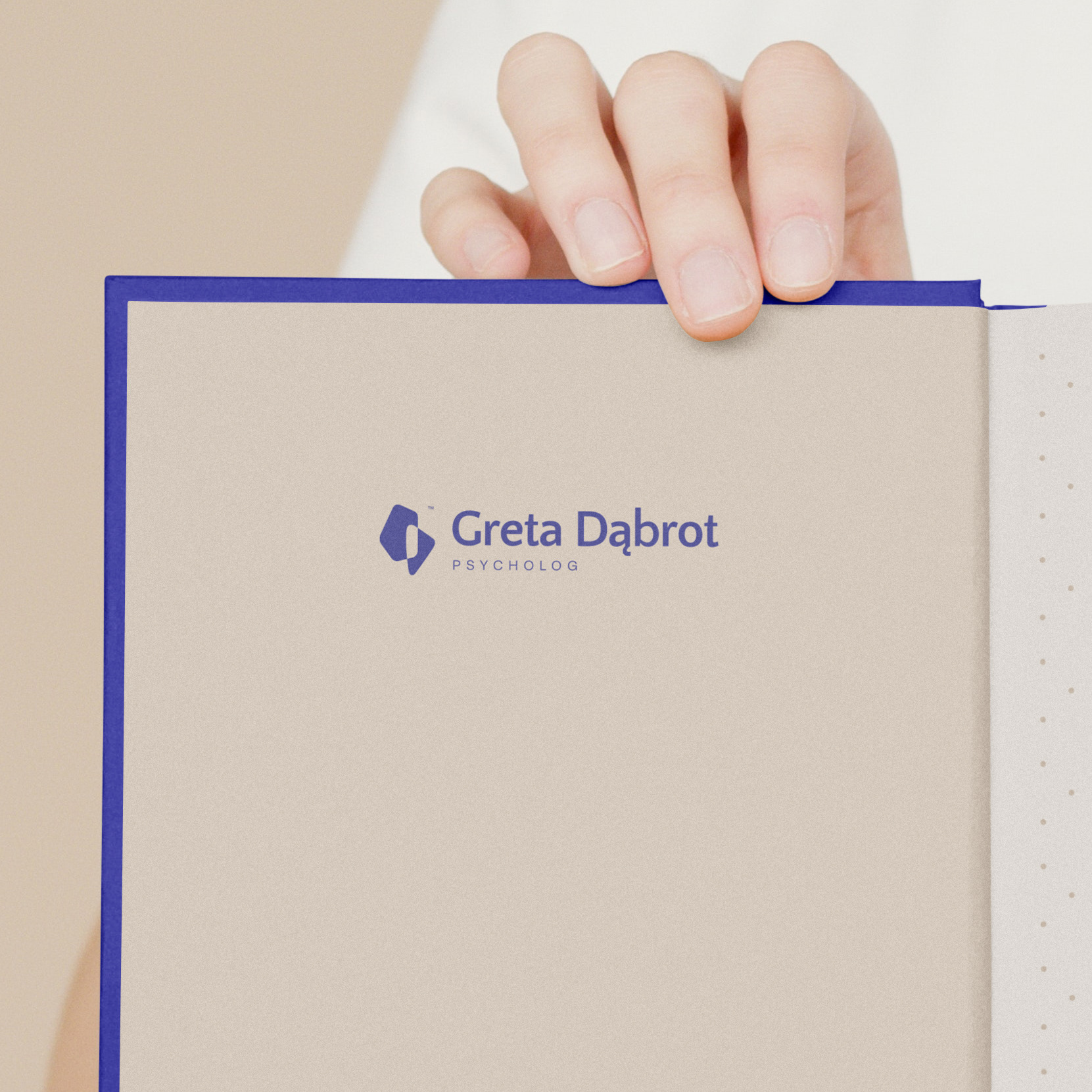
The color scheme represents peace and trust. The muted purple on a warm, sandy background is intentional.
Purple builds authority and a sense of competence. It's associated with peace, calm emotions, and depth of analysis. The beige adds a warm tone. It's not a medical, sterile white, but a color associated with comfort.
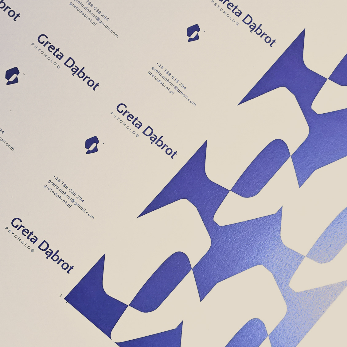
: Logo design
: Visual strategy
: Identification elements
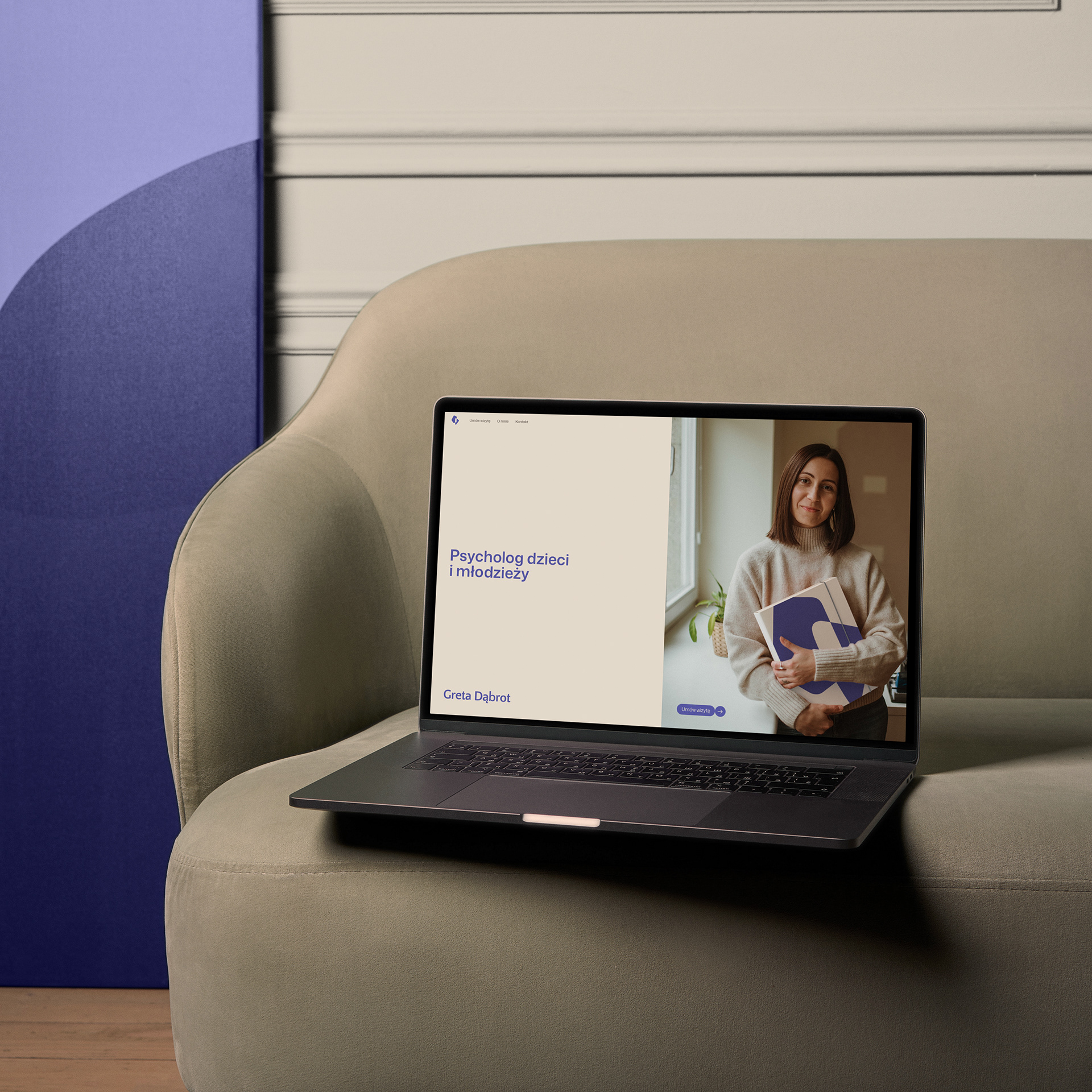
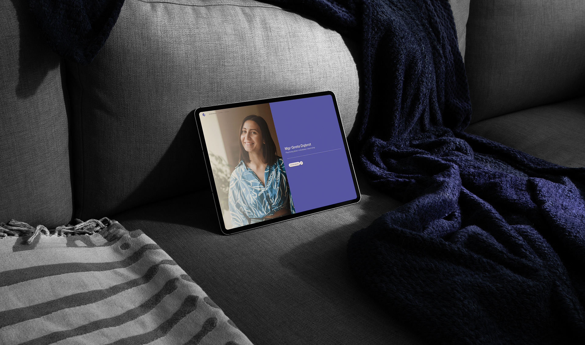
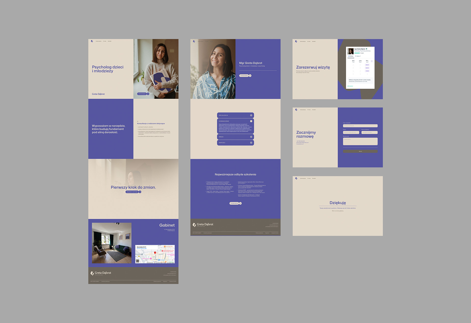
: Website design
: Framer development